 Amenities
 Campus Information


User interface
The Korean logotype
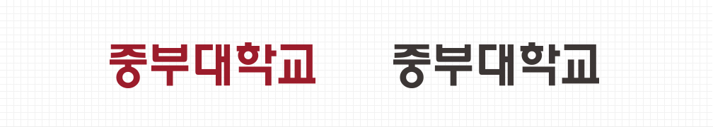
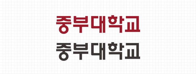
The logotype is specially designed as one of the important basic elements that form the core of V.I.S (Visual Identification System) of Joongbu University. The logo type has the function of delivering the image of the university specifically through the name of Joongbu University and was designed in consideration of the unity and combinatoriality with the symbol mark. The logo type is proportional adjustment according to the type of each font, so the font, thickness, proportion, kerning etc. of the font should not be changed arbitrarily. The color of the Joongbu University logo type is Brown. If it is used on a dark background, it can be reversed to white.
The English logotype
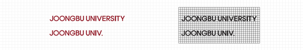
The English logotype is a unique typeface that indicates the name of the university and is the most important element that forms the core of the Central Identity Program of the Central University. In principle, the method should be based on the manual reproduction materials. If the logo type is used in a large scale, such as billboards or building wall super graphics, it should be reproduced correctly using the grid scale rules given in this section.
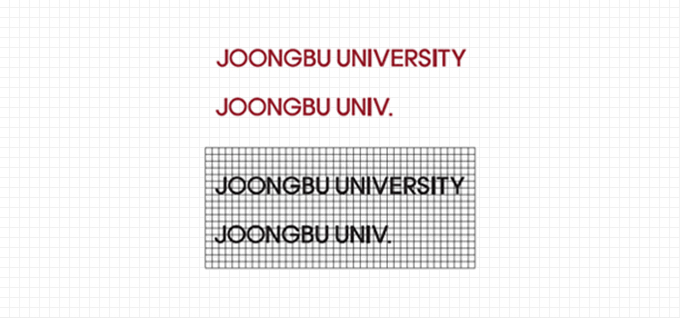
Signature English Combination


Signature English Combination is composed only by English logo and it has been developed in two types according to the number of letters or size or spacing of English logo, so the ratio and spacing of symbol mark and logo type should not be changed arbitrarily. When reproducing the signature, the reproduction material of this manual should be used as a photocopying method and a computer manuscript printing method.If it is impossible to print a photo or computer manuscript such as large-scale enlargement, it is possible to use the grid system which Produce according to the exact drawing.